Overview
GetThere® is a business travel management solution for travelers and travel managers.
Background: A required move to a new web service provided a funded opportunity to refresh the UI and improve the user experience the vehicles line of business. I was the lead designer for the project.
Empathize
When we rolled onto the project, we had six weeks to concept and prototype an end-to-end experience in order to meet a contractual obligation, so we weren’t able to empathize with our users before we began design. Thankfully, we had previously-conducted usability studies and a product owner who was very in tune with customers to guide us as we moved forward.
Interestingly, we empathized with our product partner. In prior years, the product team was paired with at least four different UX designers, each with their own ideas of how to bring improved user experiences to the product. This left the product team frustrated as they felt like direction was frequently changing.
In the early phases, our primary goal was to meet the contractual obligation while learning as much as possible from our usability studies so that we could inflict purposeful and meaningful change.
Define
GetThere addresses several personas. For this engagement, our focus was on the business traveler.
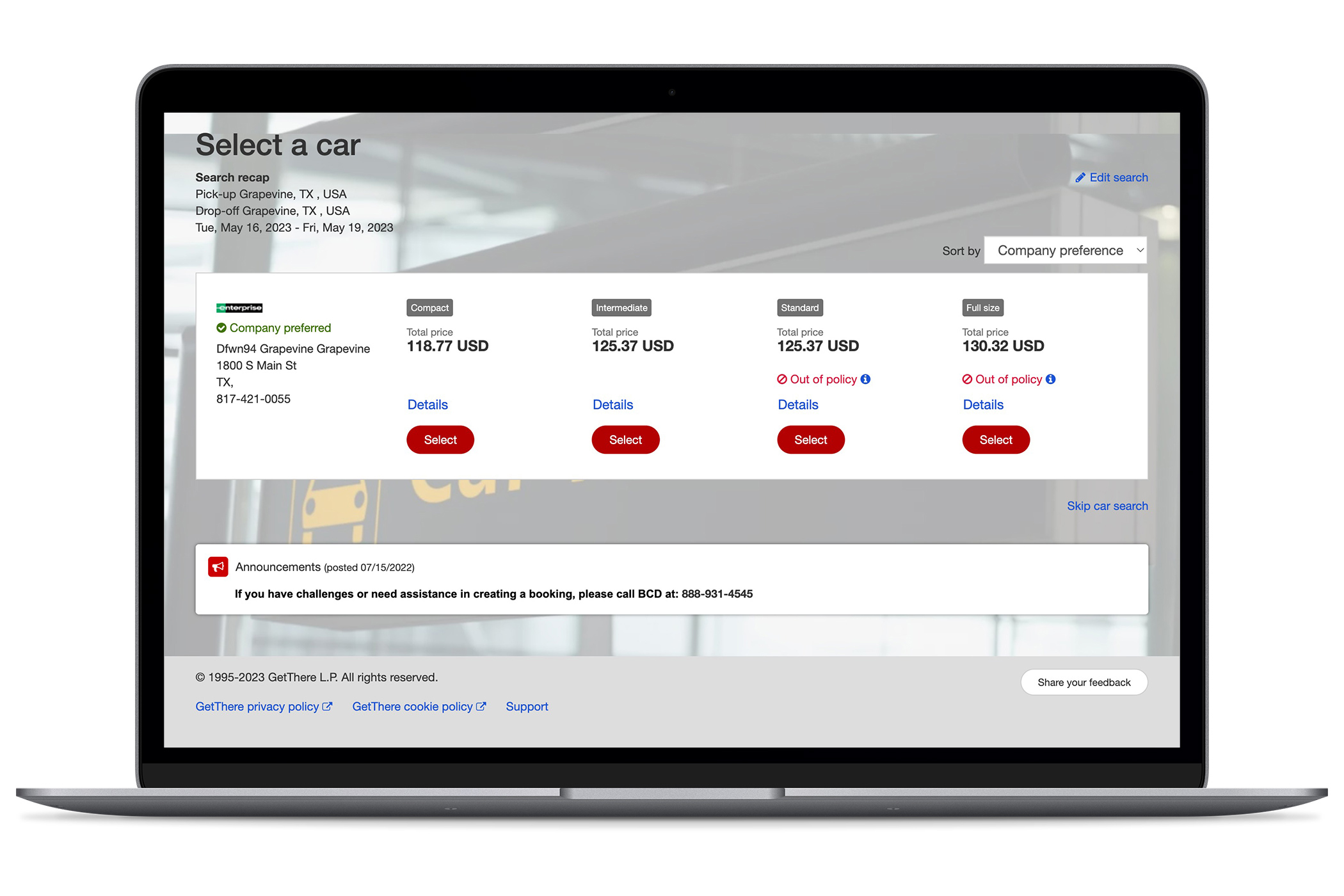
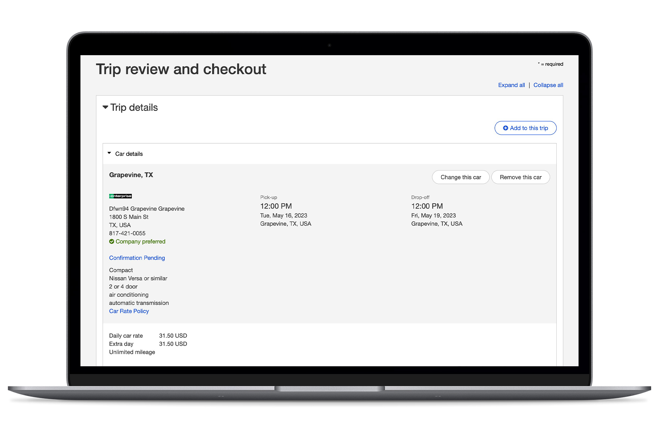
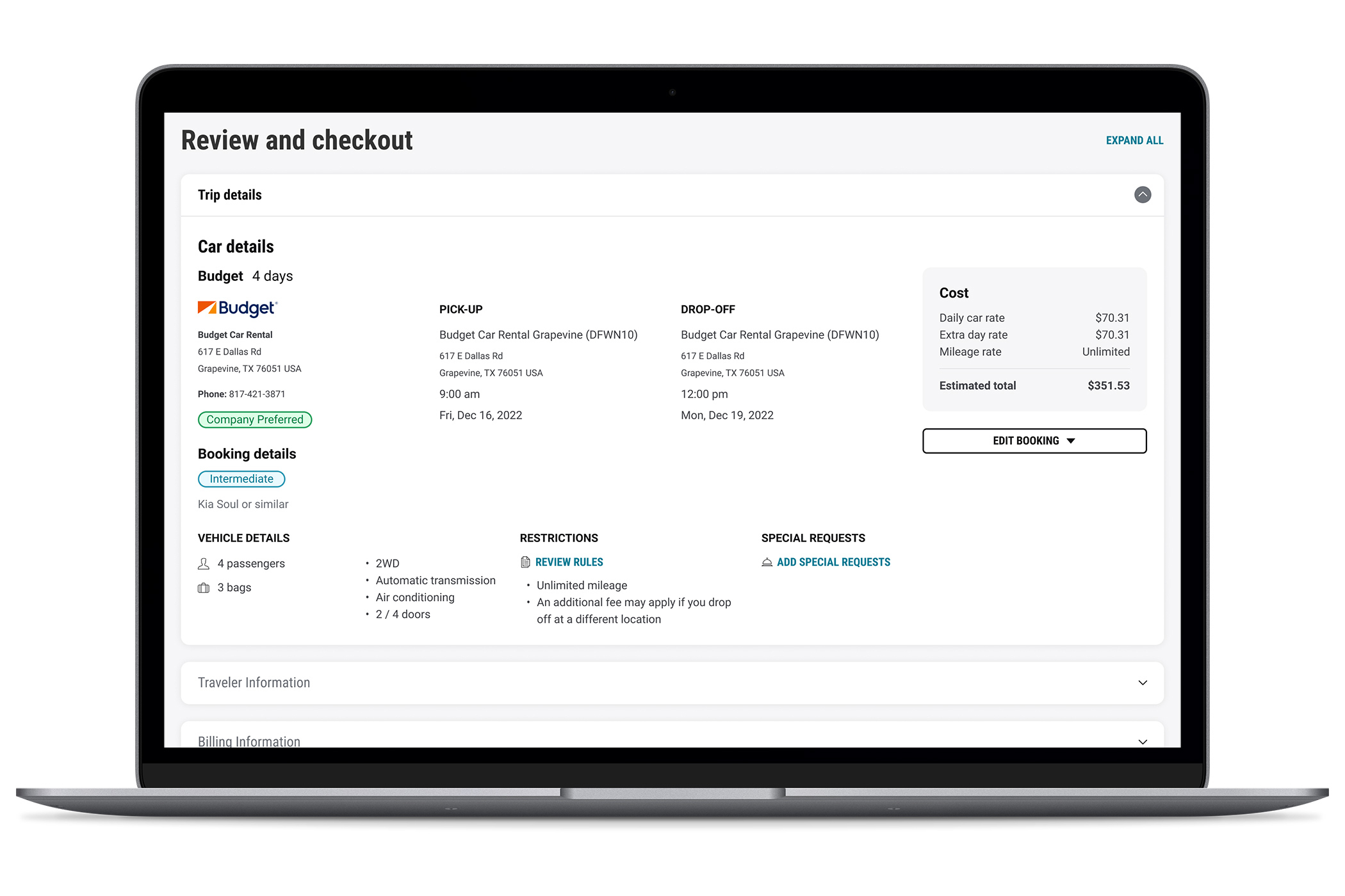
Programmatically, GetThere moved from a legacy shopping method to a new web service. This migration opened an opportunity to revamp the user interface to align with the new web service while also improving the user experience.
Within six weeks, we revamped the experience in time for a contractual user test. Our goals were to refresh the interface while caring for known issues which included:
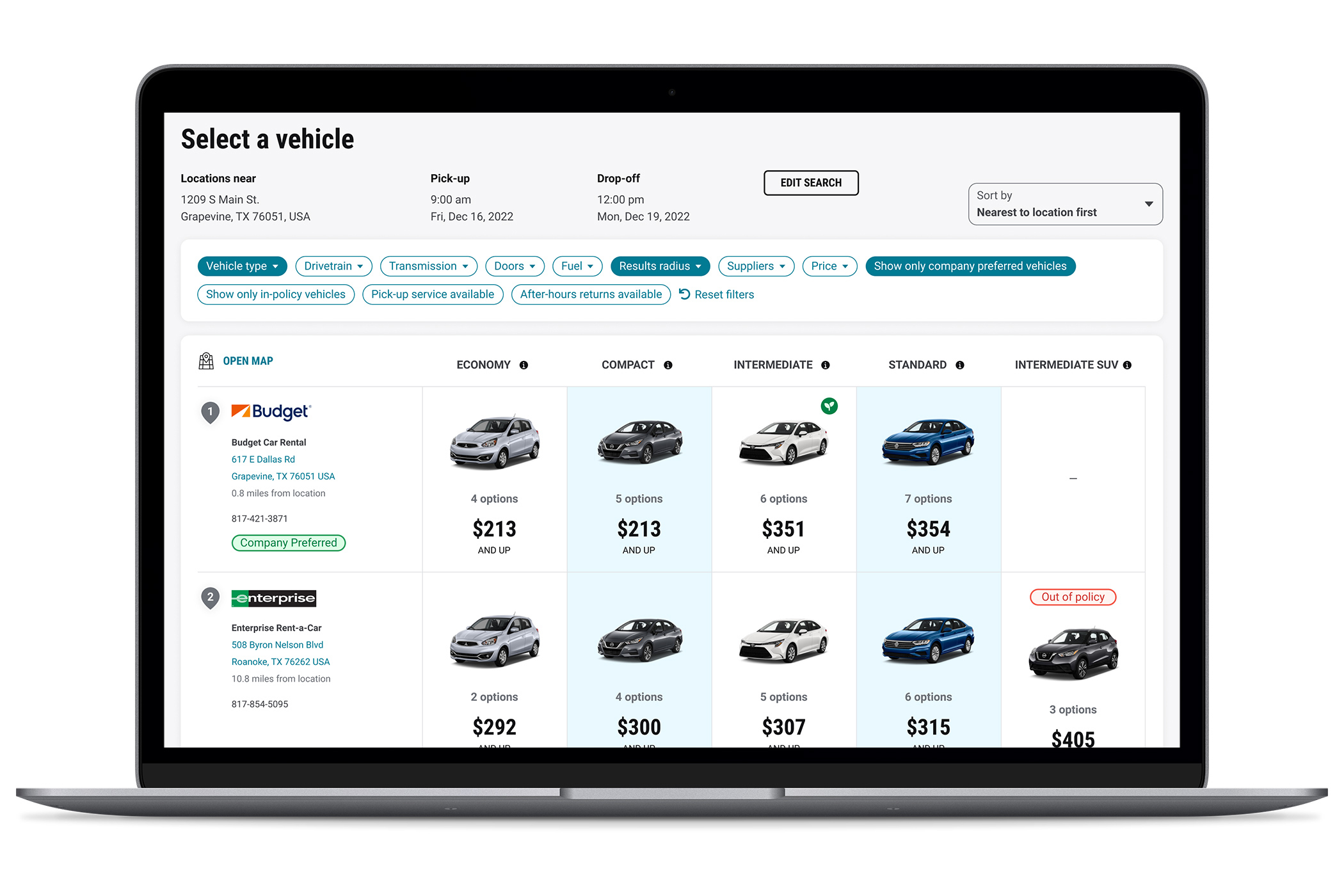
- inability to review results from multiple locations at the same time
- inability to narrow results
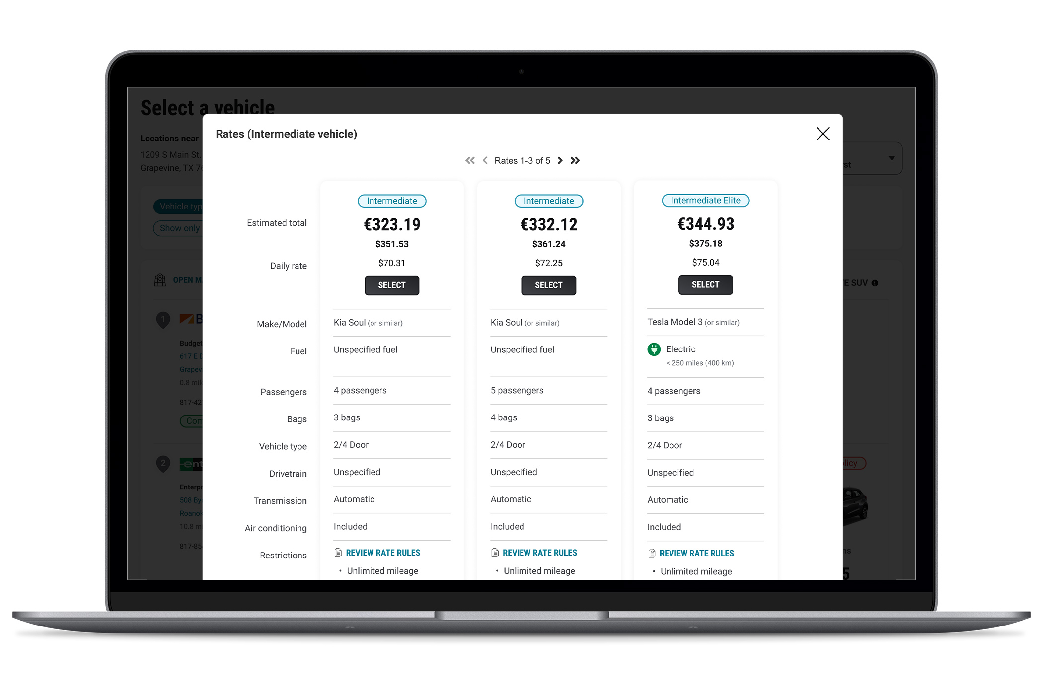
- difficulty identifying the lowest priced option in each category
- difficulty locating eco-friendly options
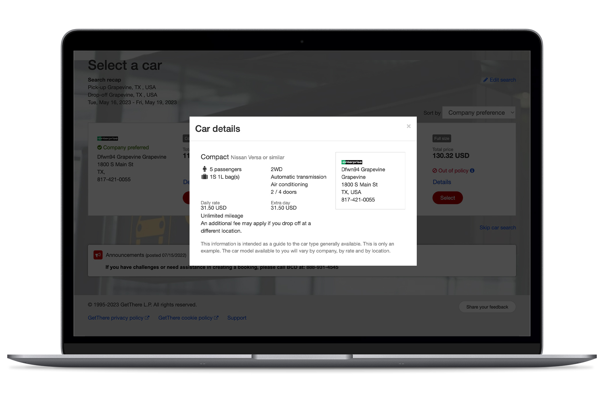
- inability to access the rental location policy
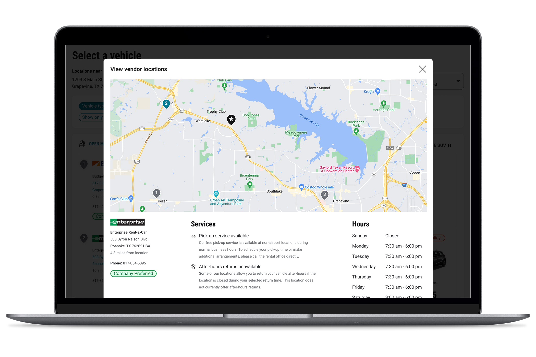
- no map of supplier locations
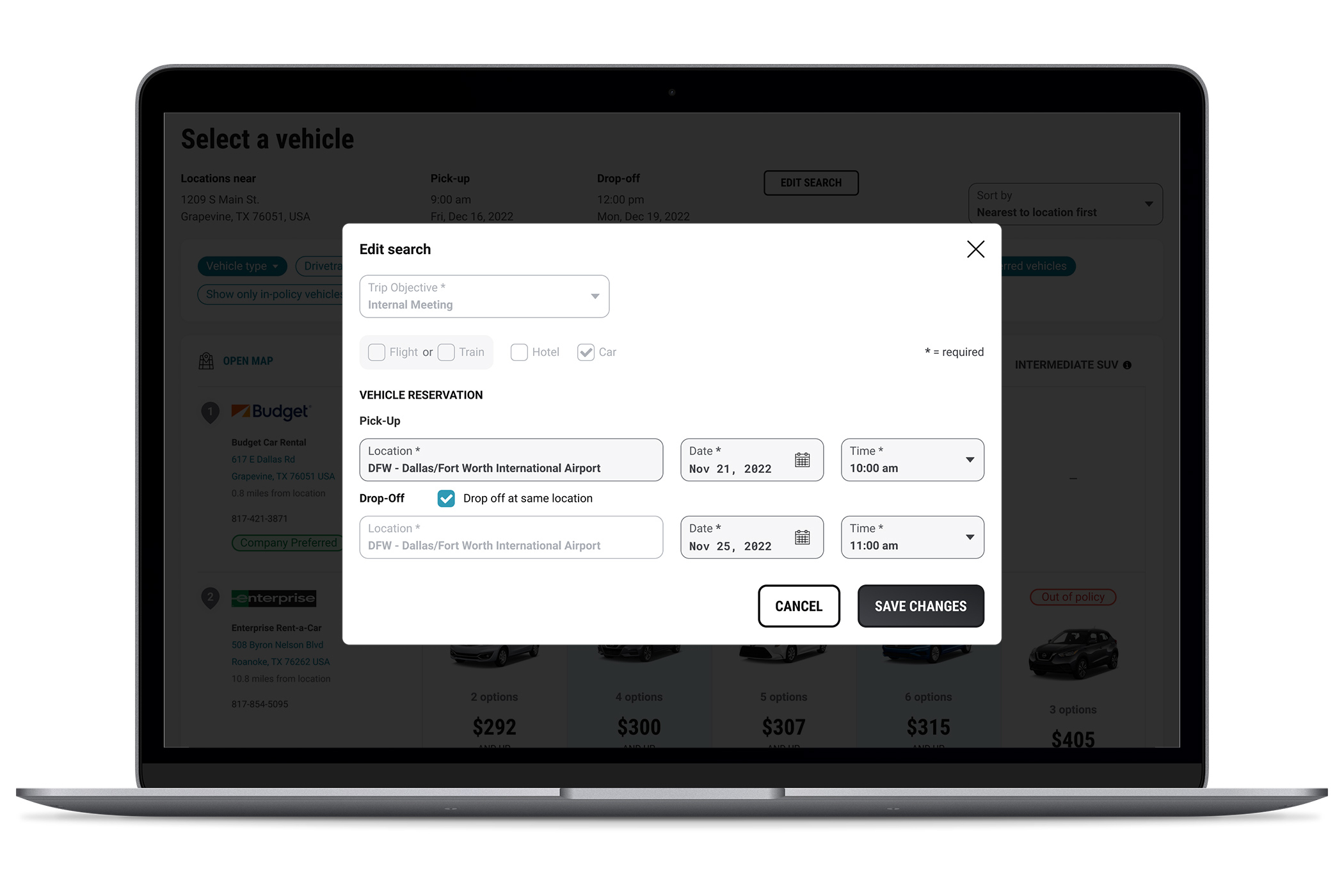
- inability to revise search in flow (user had to start over)
Ideate
With a list of known issues, we made educated guesses and were prepared to iterate. We looked to existing patterns in other lines of business within the product to help inform our path forward.
How Might We
Enable users to compare suppliers and their vehicles in a streamlined flow?
Prototype
Our goal was to understand pain points directly from our users while also learning whether or not our proposed solutions for the challenges relayed by the product team were effective.
Outcomes
After completing three usability studies, we:
- Verified that the list of suppliers, their locations and the types of available vehicles were easy to digest and manipulate via new filters that were intuitive and appreciated
- Tagged eco-friendly options with badges that were noticed and understood
- Learned that government employees focus only on the least expensive vehicles that are in policy
- Verified that a map of suppliers is “really helpful, especially when you’re not familiar with the area”
Satisfaction and ease of use ratings were both very high. No users rated either lower than 6 on a 7-point scale.
I like this very much. I like the direction you’re going, an it’s much needed. I just want to go in there and look, and I’m not even traveling!
Corporate Traveler, upon seeing new designs
The Team
I was the lead designer for this product. The vehicles redesign was concept and validated from August 2022 through December 2022.
During this time, I collaborated with one researcher, one junior designer and two product owners.
My personal responsibilities included:
- Representing the UX team in all product-related meetings
- Creating design deliverables
- Reviewing team deliverables for proper information hierarchy, visual consistency, and adherence to the enterprise design language
- Preparing prototypes
- Presenting solutions to the product team
- Managing timelines
