Overview
GetThere® is a business travel management solution for travelers and travel managers.
Background: A required move to a new web service provided a funded opportunity to refresh the UI and improve the user experience the hotels line of business. I was the sole designer for the project.
Empathize
With more time to redesign Hotels than Vehicles, we had the opportunity to hear from customers first hand: what was working and what wasn’t?
We started with an unmoderated comparative study to uncover how we stacked up against our competition. While our overall satisfaction ratings were adequate (5.5 out of 7), we still trailed the competition who clocked in with a score of 6.6.
We learned:
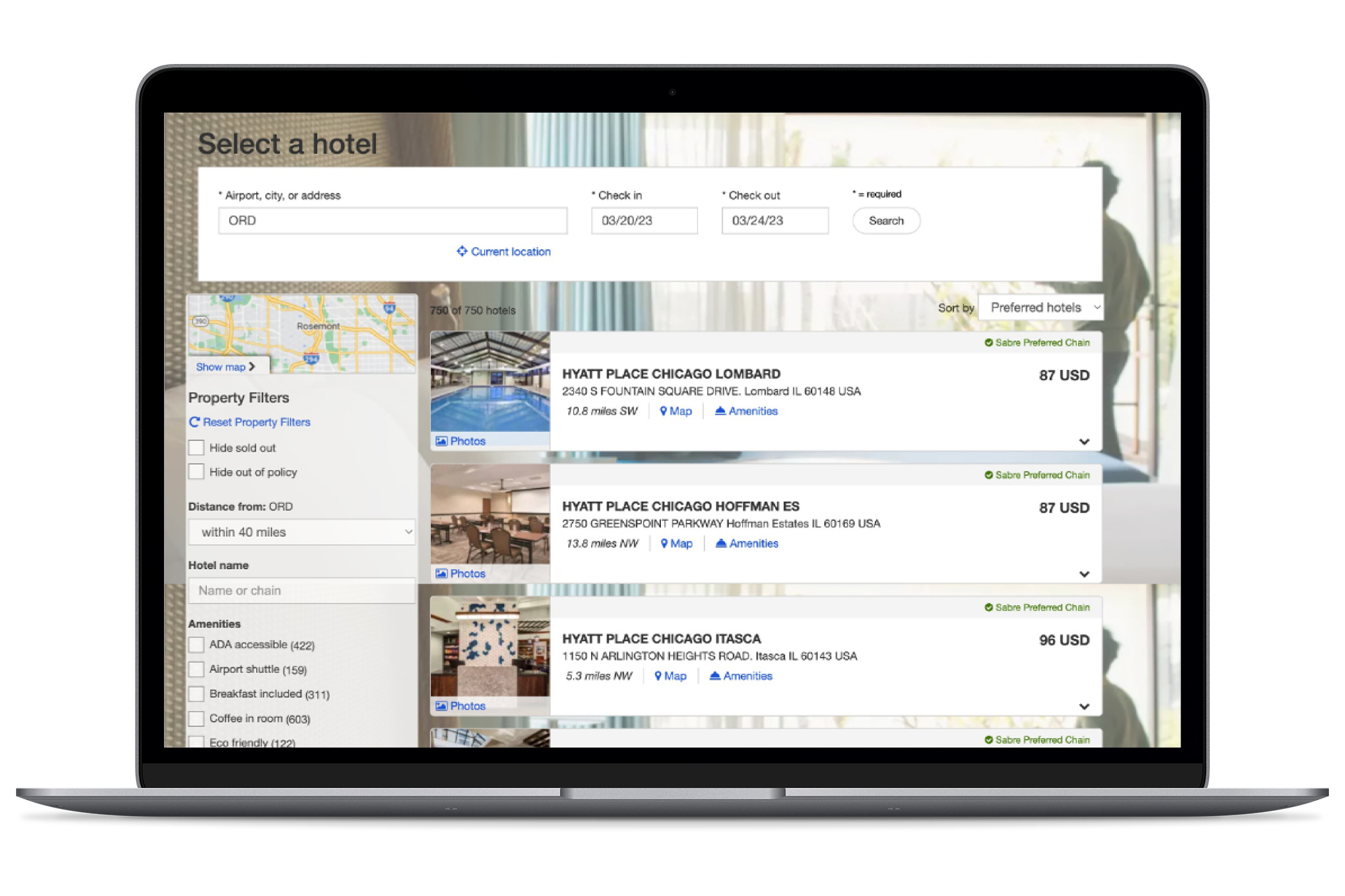
- if users were aware of our map shopping experience, they found it lacking in both function and detail
- our filters were cumbersome
- star ratings and reviews were very important and notably missing from our experience
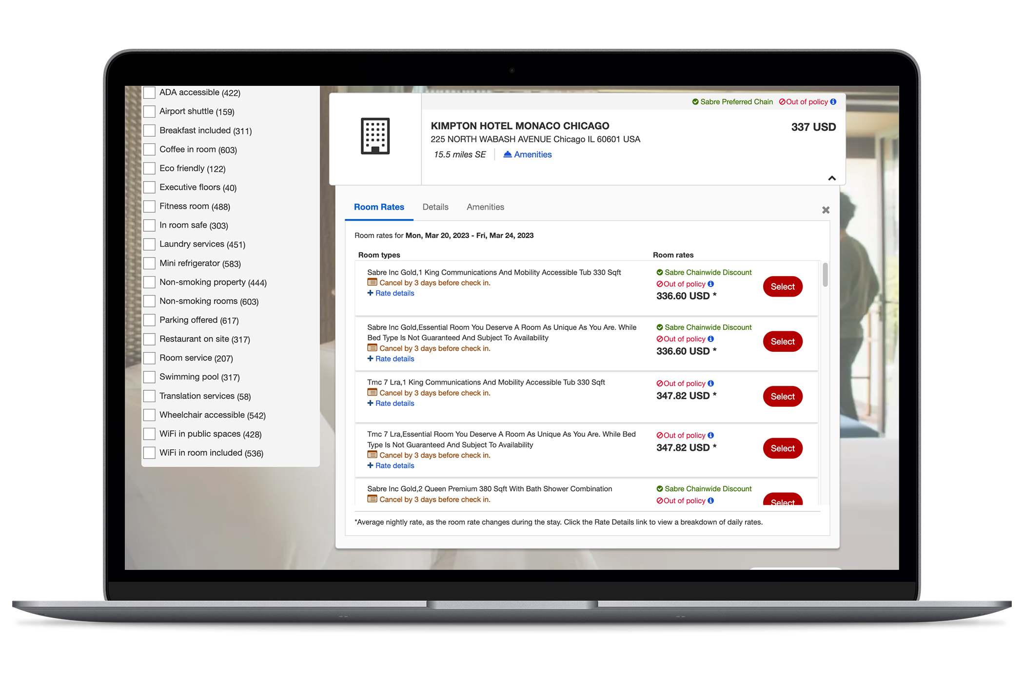
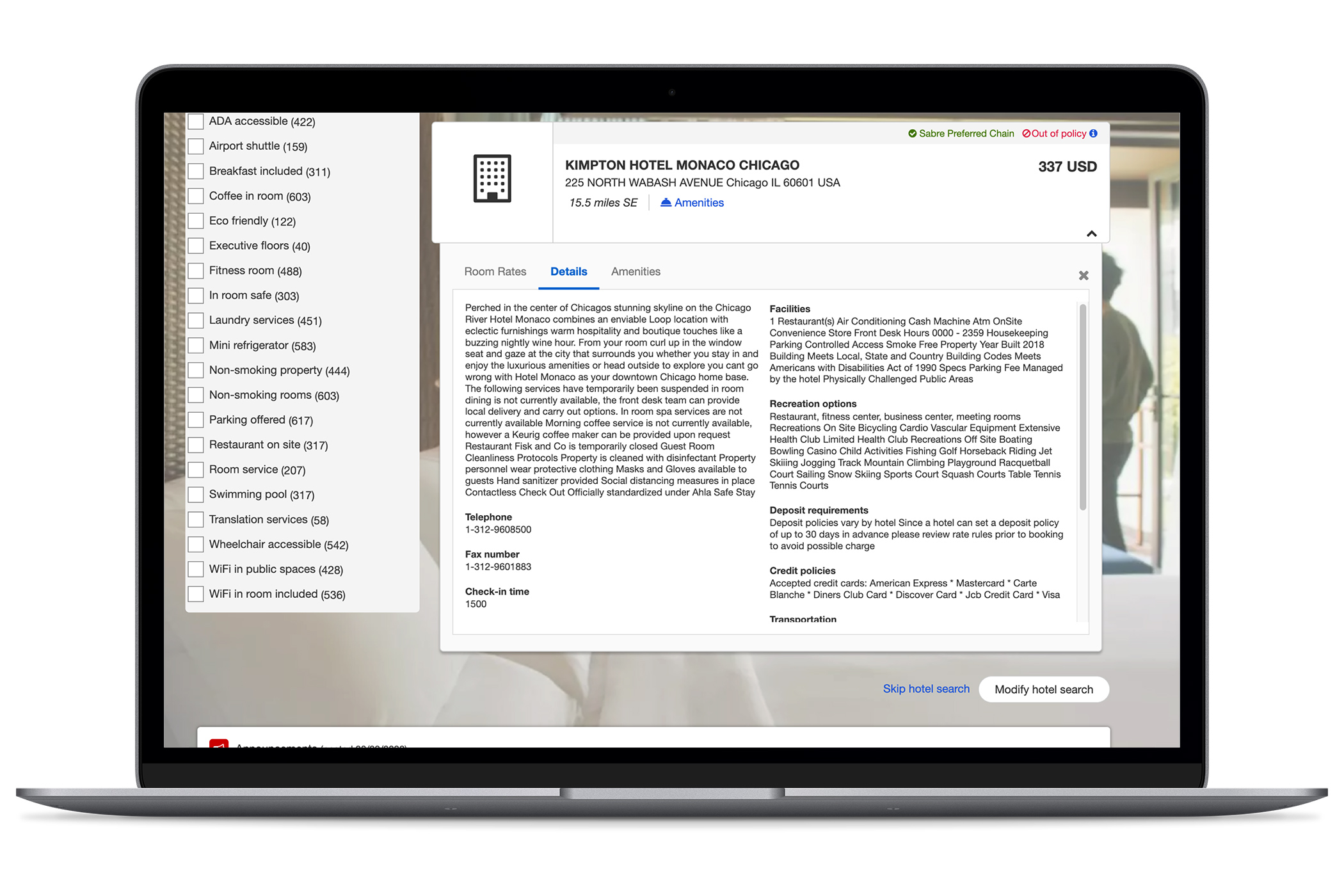
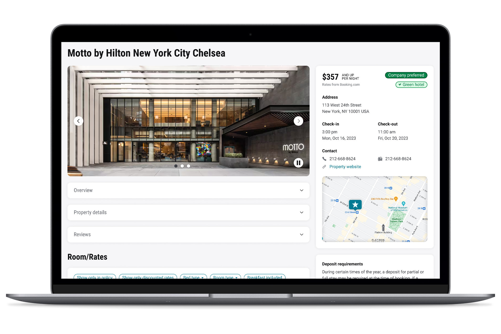
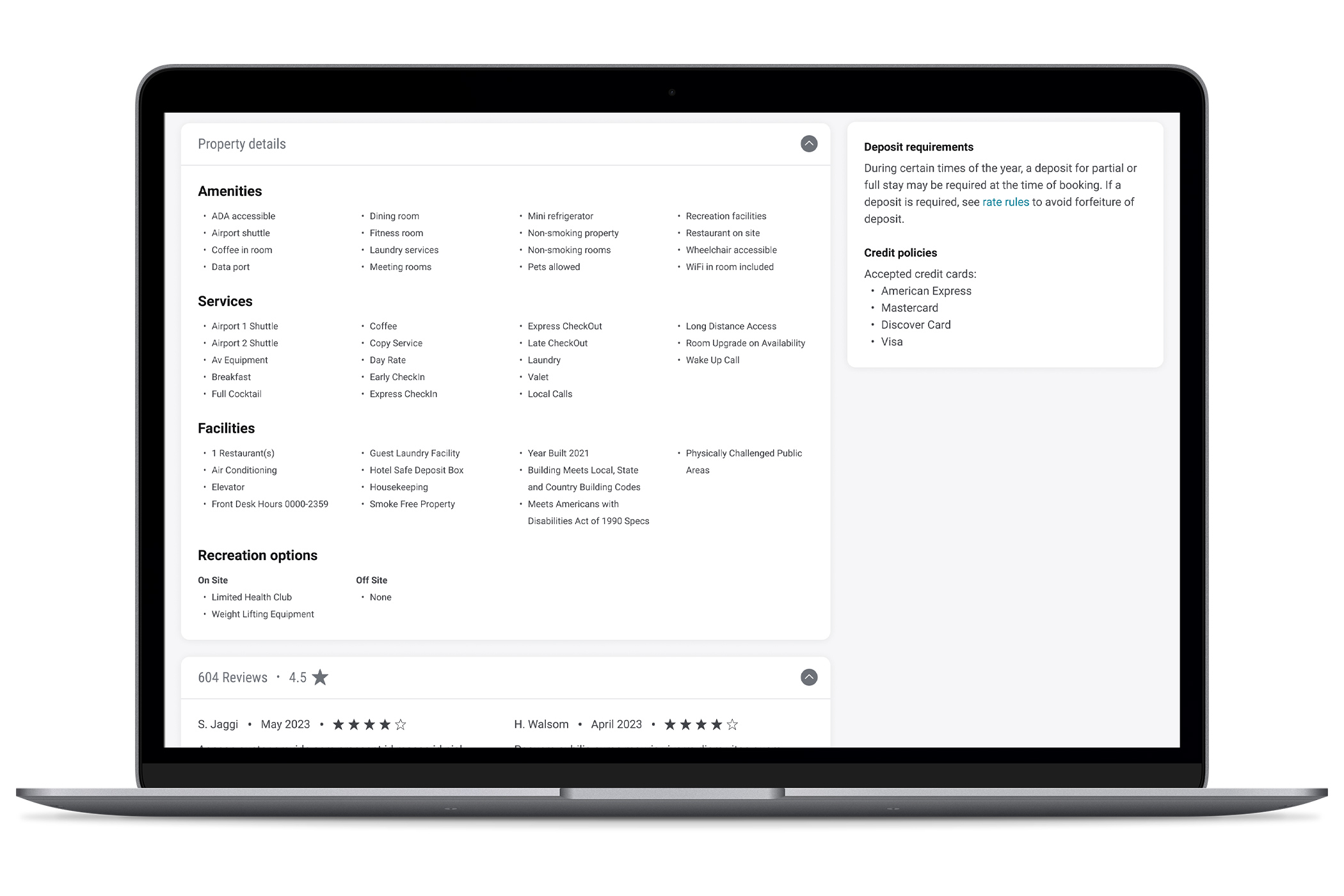
- having hotel details in a small, tabbed drawer buried key details
- our interface was underwhelming
Define
GetThere addresses several personas. For this engagement, our focus was on the business traveler.
Programmatically, GetThere moved from a legacy shopping method to a new web service. This migration opened an opportunity to revamp the user interface to align with the new web service while also improving the user experience.
Our goals were to refresh the interface while caring for issues we uncovered via our studies which included:
- simplifying the display of information while surfacing critical details
- brining photos forward to search results
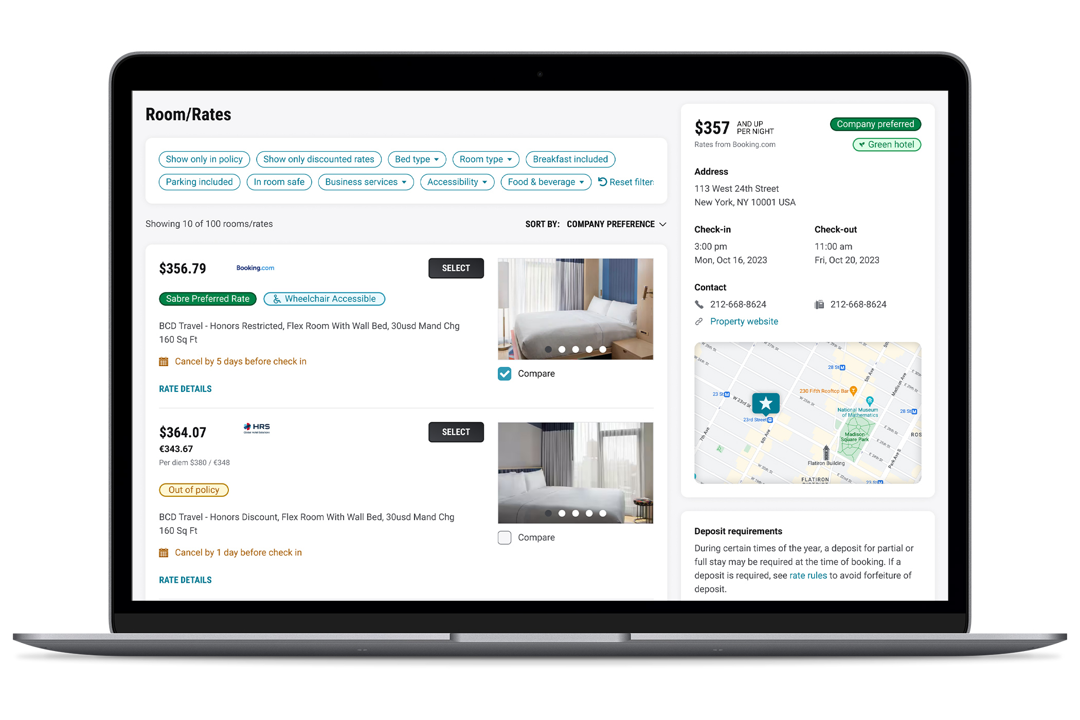
- improving filters
- facilitating the comparison of multiple properties
- aligning with the updated vehicles interface
Ideate
Our unmoderated comparative analysis highlighted the ways in which we trailed our competitors which led to our focus:
How Might We
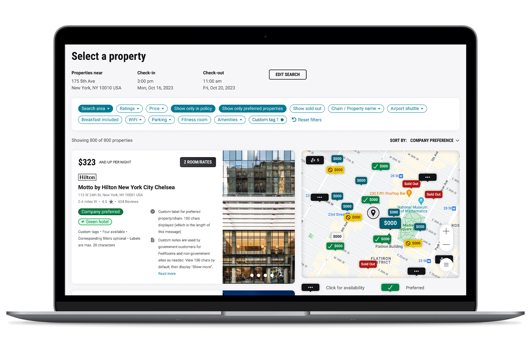
Provide a simplified, map-centric hotel shopping experience?
As a follow up to the unmoderated session, we prepared a few design concepts to share with customers. After receiving their feedback, we further refined the concepts.
Prototype
Working with a design technologist, we prepared a fully-functioning prototype so that users were able to understand how the divided view worked together to provide detailed property information. Investing in this prototype was critical in uncovering our outcomes.
Outcomes
After completing a third usability study with our prototype, we verified:
- the map and list work well together in a divided view
- users enjoyed the map-centric approach
- filters were appropriately simplified and relocated
- properties could be easily compared
- property details were easy to scan
- pockets of information could be collapsed without compromising the experience
Satisfaction: 6.28 out of 7
East of use: 6.33 out of 7
I really like this! I didn’t think the other one was bad, but I feel like maybe we went from a Best Western to an Omni.
Corporate Traveler, upon seeing new designs
The Team
I was the sole designer for this product. The hotel redesign was concepted and validated from April 2023 through November 2023.
During this time, I collaborated with one researcher, one design technologist and two product owners.
My personal responsibilities included:
- Representing the UX team in all product-related meetings
- Creating design deliverables
- Presenting solutions to the product team
- Managing timelines
