Overview
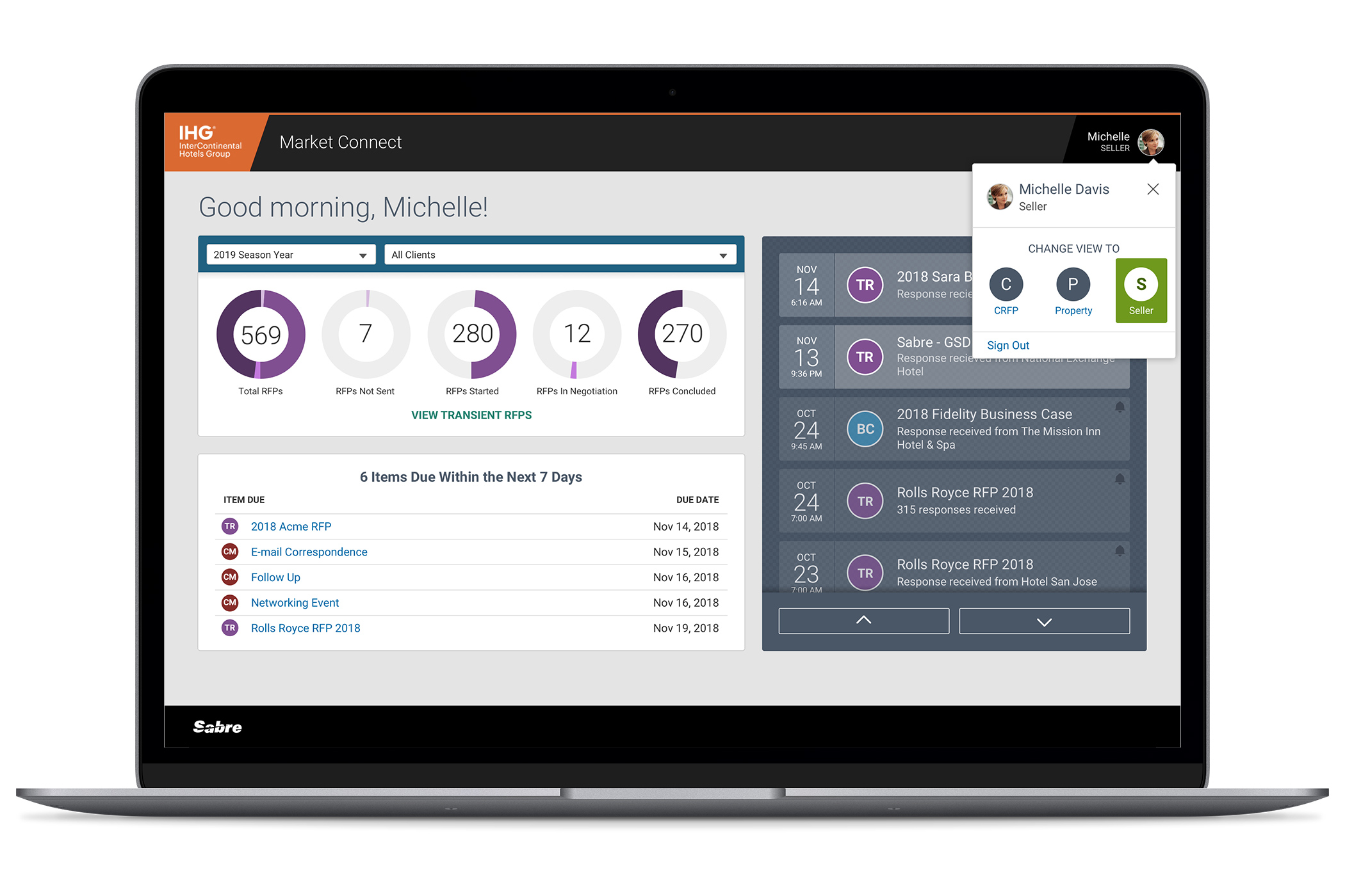
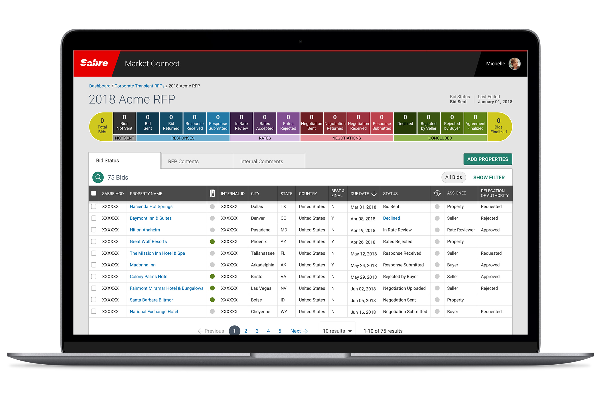
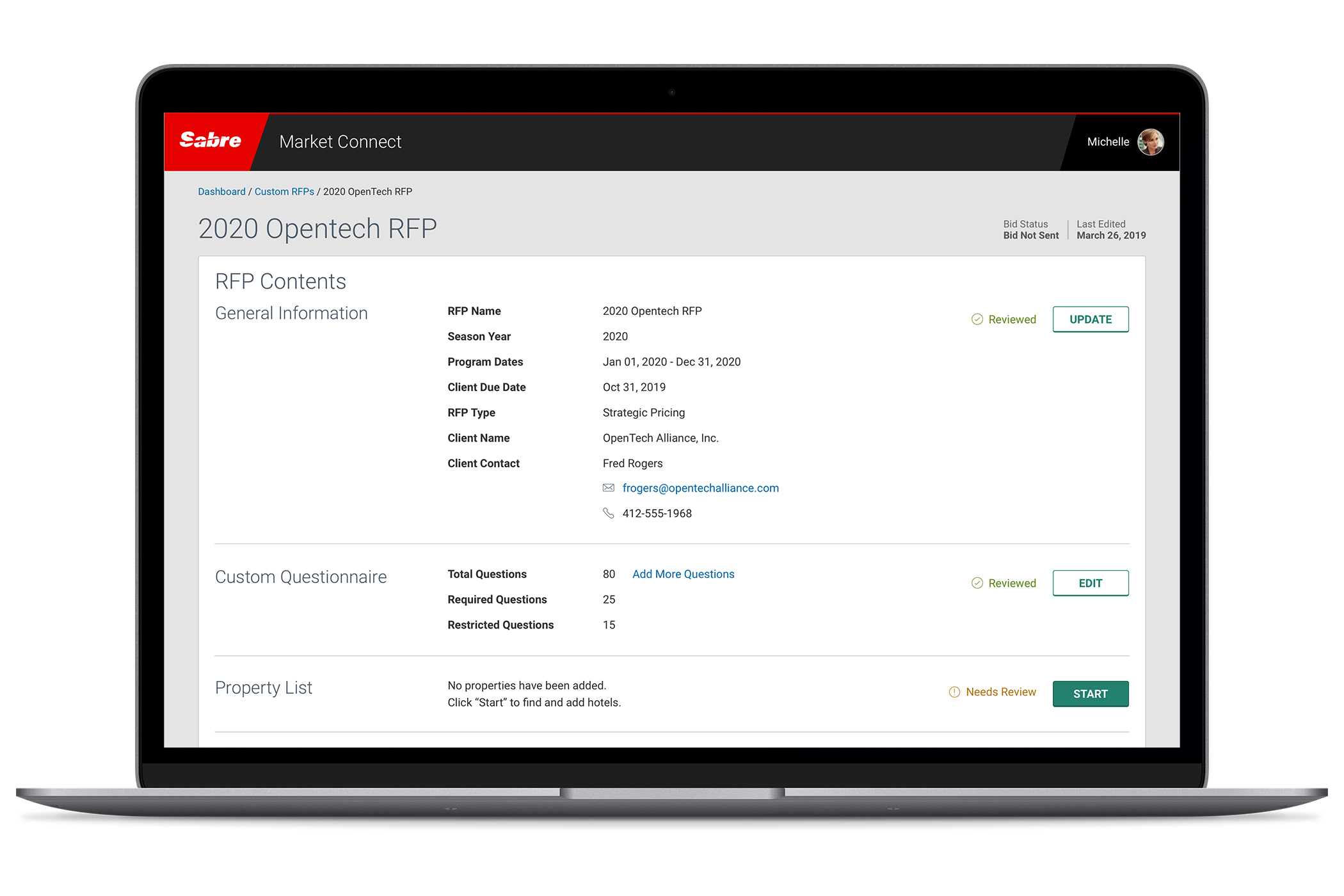
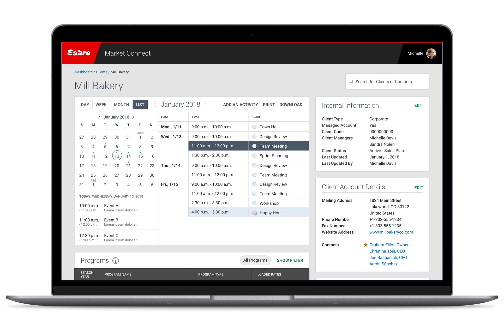
Market Connect is a suite of tools that offer a holistic approach to corporate hotel bookings.
Background: Sabre partnered with one of the world’s leading travel suppliers, InterContinental Hotels Group (IGH), to create a consolidated suite of products that empowered hoteliers to make their rates available to a broad audience.
Empathize
This project started with little to no empathy. Business partners mandated that we combine a handful of existing products into a consolidated suite that would hopefully appeal to customers.
When hospitality powerhouse IHG signed on as an early adopter, empathy quickly followed.
Internally, we shifted from “what might we offer” to “how might we best empower our users.”
Our daily interactions and deep customer integration helped us truly know, understand and empathize with our users. We unpacked years of frustrations and objectives, then cared for each of them piece by piece.
Define
This is the largest project I’ve ever worked on. Hundreds of teammates spanned multiple continents. On top of the logistical nightmare, employees changed both within our companies and the project.
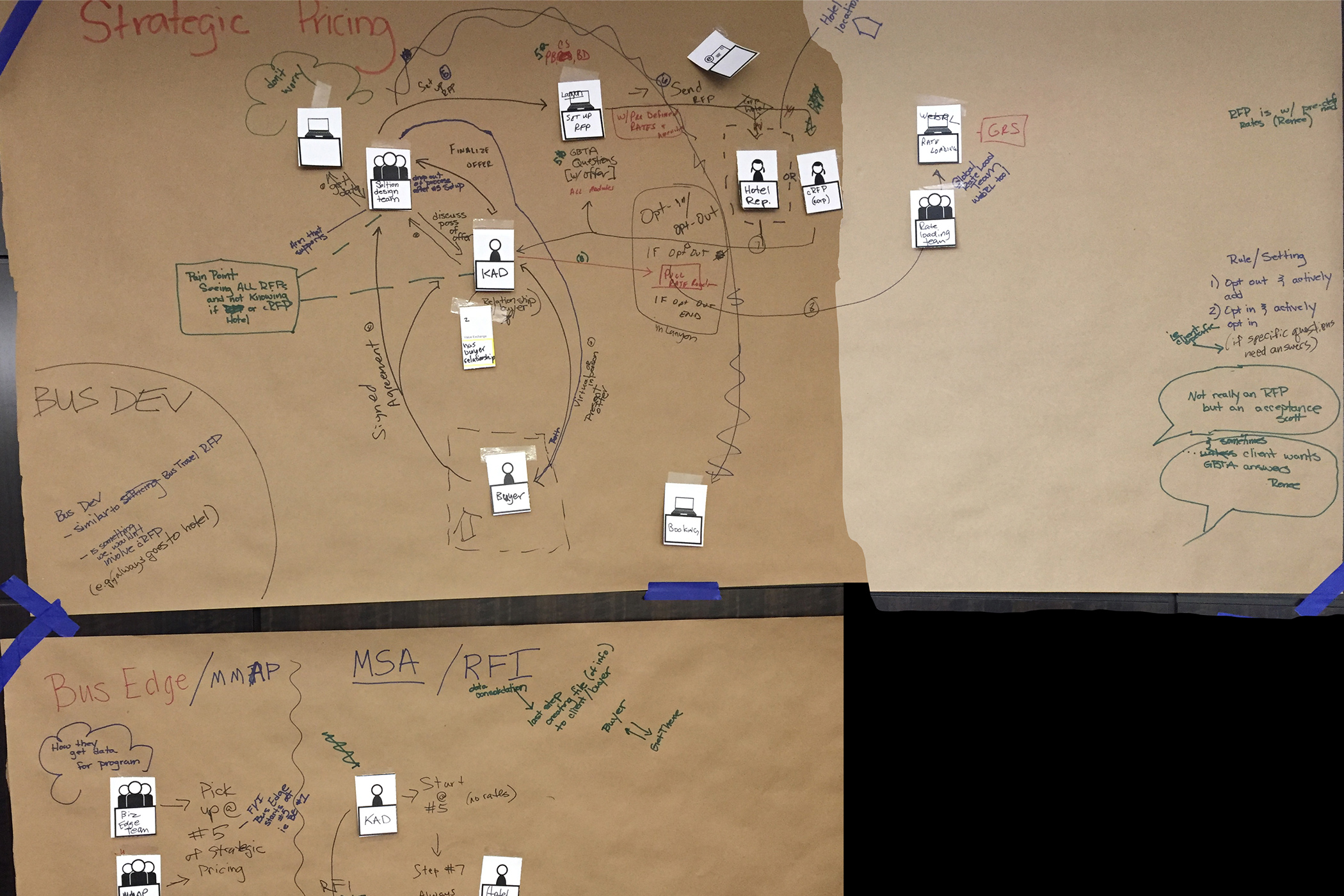
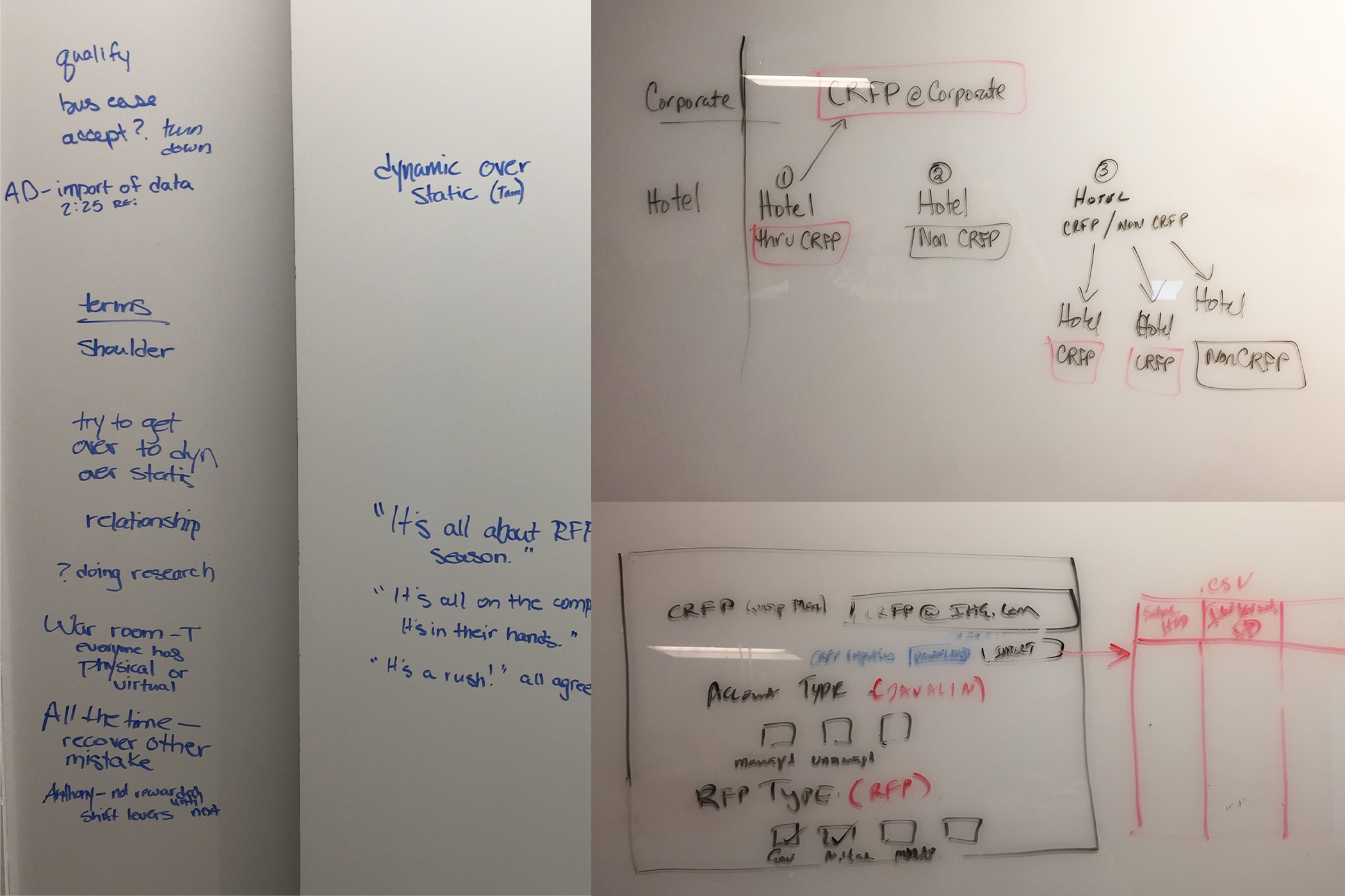
In October 2017, a design strategy team conducted a workshop with our hotel partner, InterContinental Hotels Group. During that time, the product was defined by seven sections. In February 2018, I joined the team. Our strategy team worked alongside us until May, then rolled off, leaving us to carry the work forward.
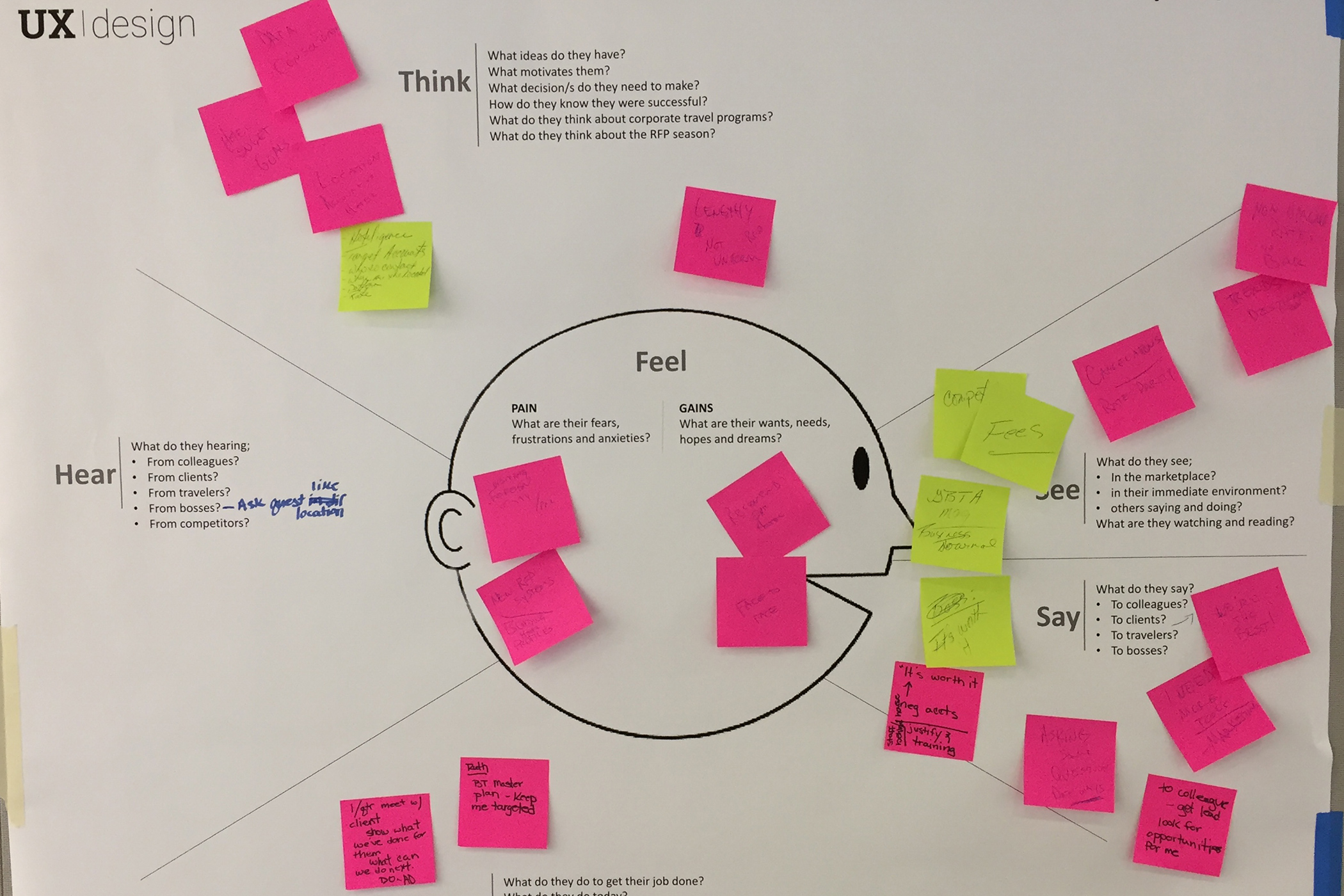
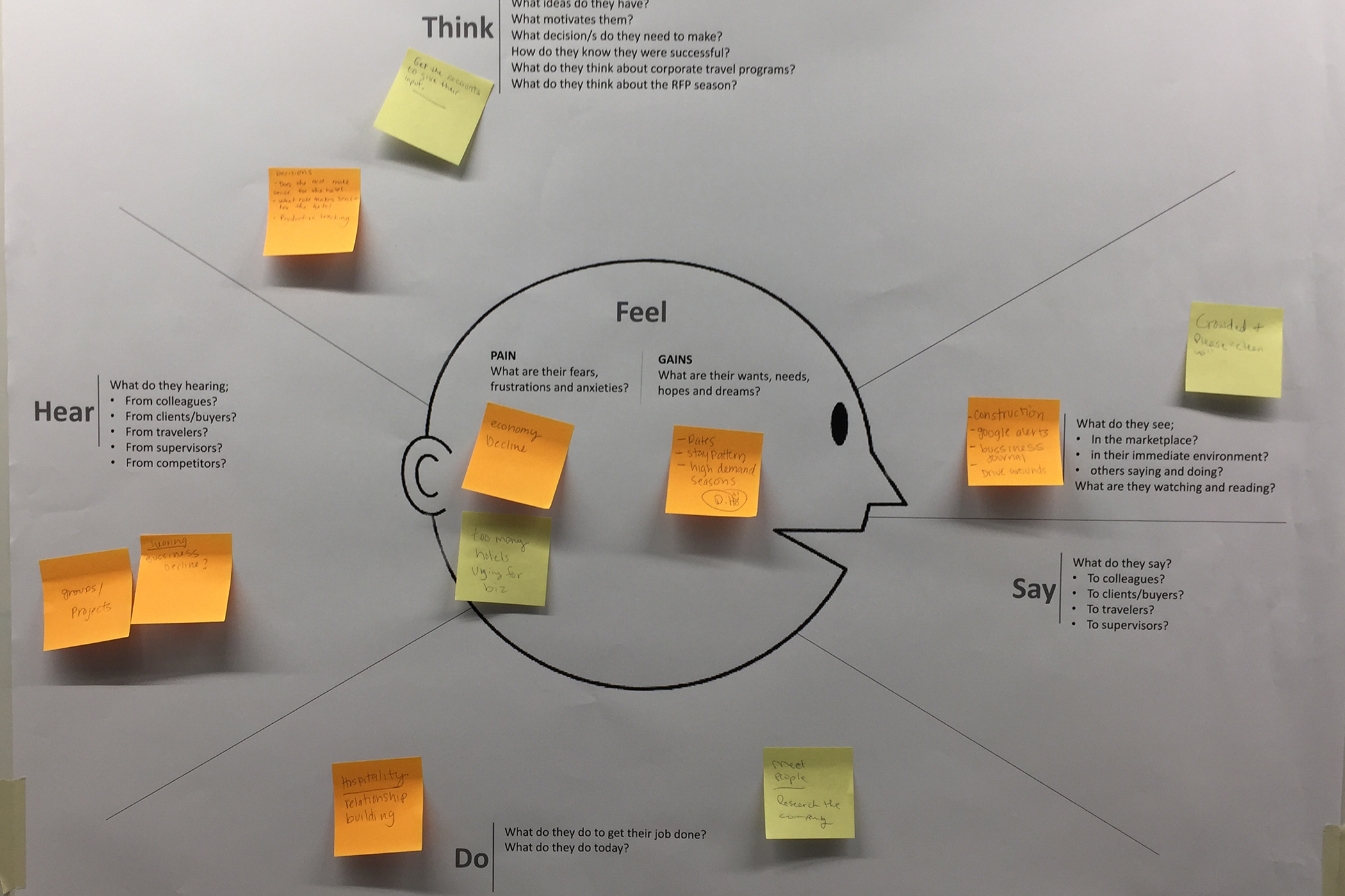
We first researched and built 11 personas. Because every persona performed different tasks within each product feature, defining and referencing the personas was critical.
We faced three primary challenges for the product itself:
- An integrated platform.
With integrated buyer and supplier workflows, providing the right view and capabilities at the right time (based on user type) was a challenge. Our role-based personas allowed us to tailor the application to the user and task at hand. - Simplified tasks.
This product included many tasks and multiple steps at each stage. The UX team reduced friction and increased efficiency by decreasing the number of steps required to complete a tasks, making the product more intuitive. - Seasonal activity.
The annual cycle of RFP and associated tasks presented a challenge for users who may not use the application for a long period of time. In that environment, our design had to support easy learning so users were not required to remember everything from year to year.
As a large team, we devised a five-step process:
- Product created a business requirements document.
Problem: BRDs were incomplete, and requirements were fuzzy.
Solution: Product presented the BRD to UX and dev. All teams reviewed it individually then discussed collectively and signed off on the scope. - UX delivered the user interface.
Problem: Product struggled to identify missing pieces when looking at low-fidelity screens.
Solution: UX delivered high-fidelity screens so product could easily identify necessary changes. - Product and UX team iterated.
Problem: In the beginning, we created a lot of throw-away work.
Solution: With a BRD sign-off across all teams, UX created more comprehensive solutions and validated them in usability studies. Feedback was heard and adopted by the product team. - Development began; UX revised the UI.
Problem: With teams located on opposite sides of the world, development happened in a vacuum.
Solution: Screen flows were provided to communicate flows. As the product came to life close to the intended vision, details were easily ironed out. - Code pushed to QA.
Problem: The coded product was not 1:1 with the supplied UI designs.
Solution: UX provided alignment specs and code updates to bridge the gap.
Ideate, Prototype, Test and Outcome
This project was the poster child for the ideation/prototyping iterative cycle.
While on the project, we created and tested over 20 prototypes. We designed based upon what we knew internally and from our hotel partner. We met with end users, failed fast, went back to the drawing board, devised new solutions and tested again.
In some studies, we focused on big, end-to-end flows. On others, we focused on navigation, findability, presentation and satisfaction of content. While we weren’t afraid to be wrong, our philosophy was: when in doubt, ask.
Although our early studies only had an average success rate of 52%, they were informative. As the vision for the product became clearer, ratings climbed. We topped out with a 98% average success rate and a 6.4 out of 7 ease-of-use score.
The Team
I led the design of the product suite from January 2018 – October 2020.
During this time, I partnered with six UX designers, two researchers, six product owners, 90+ developers, three training and onboarding specialists and five representatives from one of the world’s leading hotel companies.
My personal responsibilities included:
- Representing the UX team in all product-related meetings
- Dividing work among teammates
- Creating design deliverables
- Reviewing team deliverables for proper information hierarchy, visual consistency, and adherence to the enterprise design language
- Preparing prototypes
- Presenting solutions to the product, technical and customer teams
- Managing timelines
